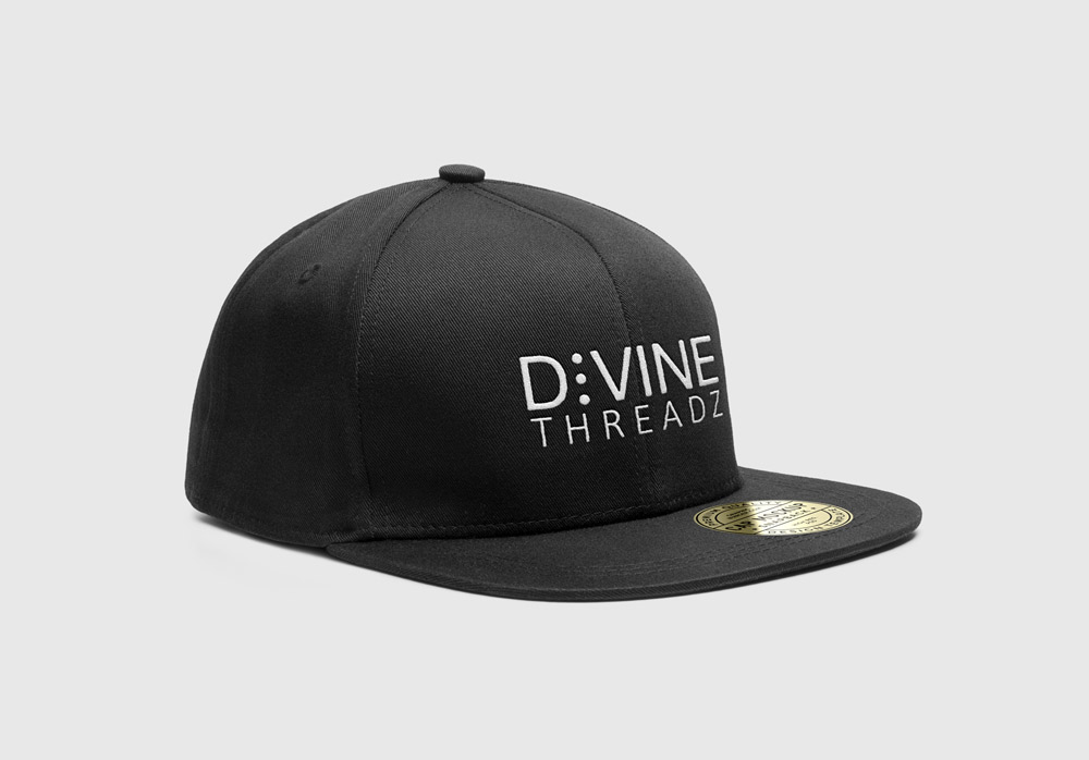
Logo design and product mockups for Divine Threadz, a Seattle extreme sports brand.
Logo design and product mockups for Divine Threadz, a Seattle extreme sports brand.
The client has wanted to build an extreme sports brand since the mid-90s. The brand would be focused on cycling and wave sports. The client has also expressed interest in subtly hinting at his religious convictions with the brand.
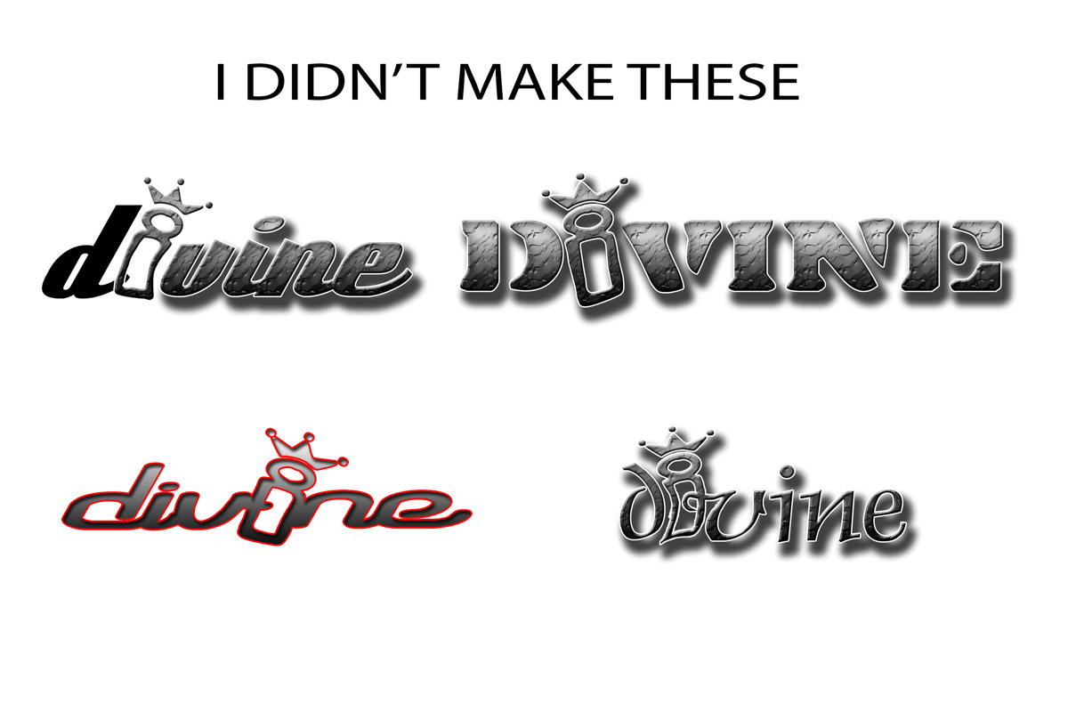
The client had another person make an attempt at the project about 15 years previous. They seemed to be really stuck on making the lower case i an allegorical glyph, actually representing a man/king/jesus figure.
From this I gleaned that we needed at least some symbolism representing the client’s views, albeit trying to steer away from beating them over the head with it.
Since the target market was extreme sports The main competitors I was able to find were Monster, Fox Racing and Alpinestars or A-star.
Fox is a major sports brand. It also has a very versatile logo design, both in the scope of the merchandise (clothing, hats, bike armor, etc.) and in the way the logo is used (sometimes the logomark alone, sometimes the wordmark alone, sometimes blended as shown here.)
This logo works. It feels fast, using an italicized look to show that it is moving forward. The construction of the letters also feels tough and sturdy, which is reinforced by the width of the glyphs as well as the width of the stroke. There is also some subtle reference to the motorcycle industry, in that the fox’s eyes are actually handlebars.
Call me tacky, but I have always loved this logo. It is iconic, it stands out, and someone can read a lot into it, just by looking at the logomark.
I love the dual use monster scratch/m. This makes this brand have edge and tension. The designer doubled down by using the neon green negative space to complete the shape.
Symbolically, one can read a sense of danger or bravery, the type choice has a gothic reference, which gives the sense that there is history or mystery to the product. These all are themes that feel fitting for the extreme sports industry.
Trying to honor the focus on the crown and ‘I’ glyph as a person, I started sketching to see if there was a way to make the crown seem more modern and more fitting of the extreme sports industry, while not hammering the audience over the head with a hard religious message.
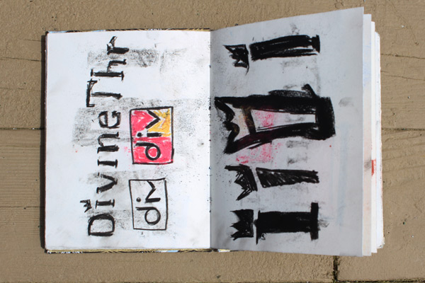
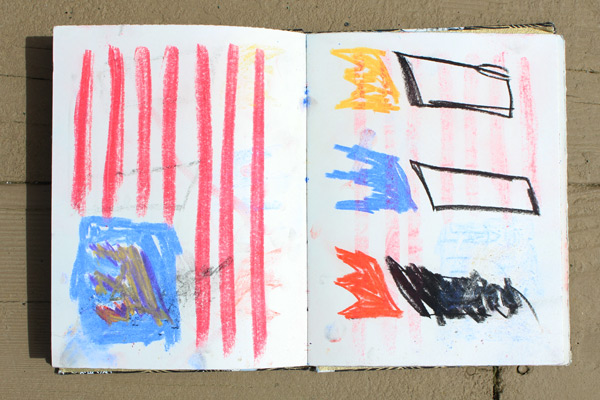
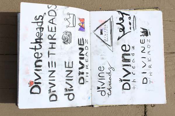
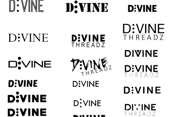
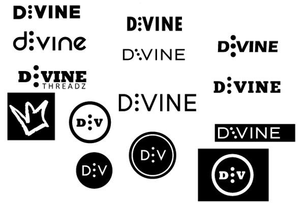
After 30+ pages of crown iterations the client and I both agreed that Divine Threadz has a verbal message already and that the visual message could be a bit more subtle while still having a subtext. So I studied some symbols of divinity: The triangle, the cross, the crown, the trinity. The client liked the idea of representing the trinity with three simple dots. On to digital iteration.
